MODERNISING A CENTURY-OLD BRAND WHILE PROTECTING ITS LEGACY
THE CHALLENGE
Draper Tools is one of Britain’s most established tool brands, with more than a century of history. But by 2022, it was clear that while Draper had strong recognition with older generations, younger audiences weren’t connecting with the brand in the same way.
The logo – a thick, block-serif wordmark inside a bold lozenge – had served the business well since the 1990s. But it no longer reflected Draper’s mission: a forward-thinking brand with ambitious growth plans.
The challenge was to modernise the visual identity without losing Draper’s authenticity – to evolve, not reinvent. And to create a brand architecture that clearly separated Draper and Draper Expert, giving both clarity, purpose and room to grow.


THE STRATEGIC APPROACH
- To modernise Draper visually and emotionally, connecting with a new generation of customers.
- To clarify brand hierarchy internally and externally, giving Draper Expert its own premium space in the market.
THE CREATIVE SOLUTION
The redesign was subtle but significant. The original lozenge remained, preserving Draper’s recognisable form, but the typography was completely redrawn. The new wordmark uses a refined, extended sans-serif – cleaner, sleeker, and more precise – surrounded by a thinner lozenge line to give it breathing room.
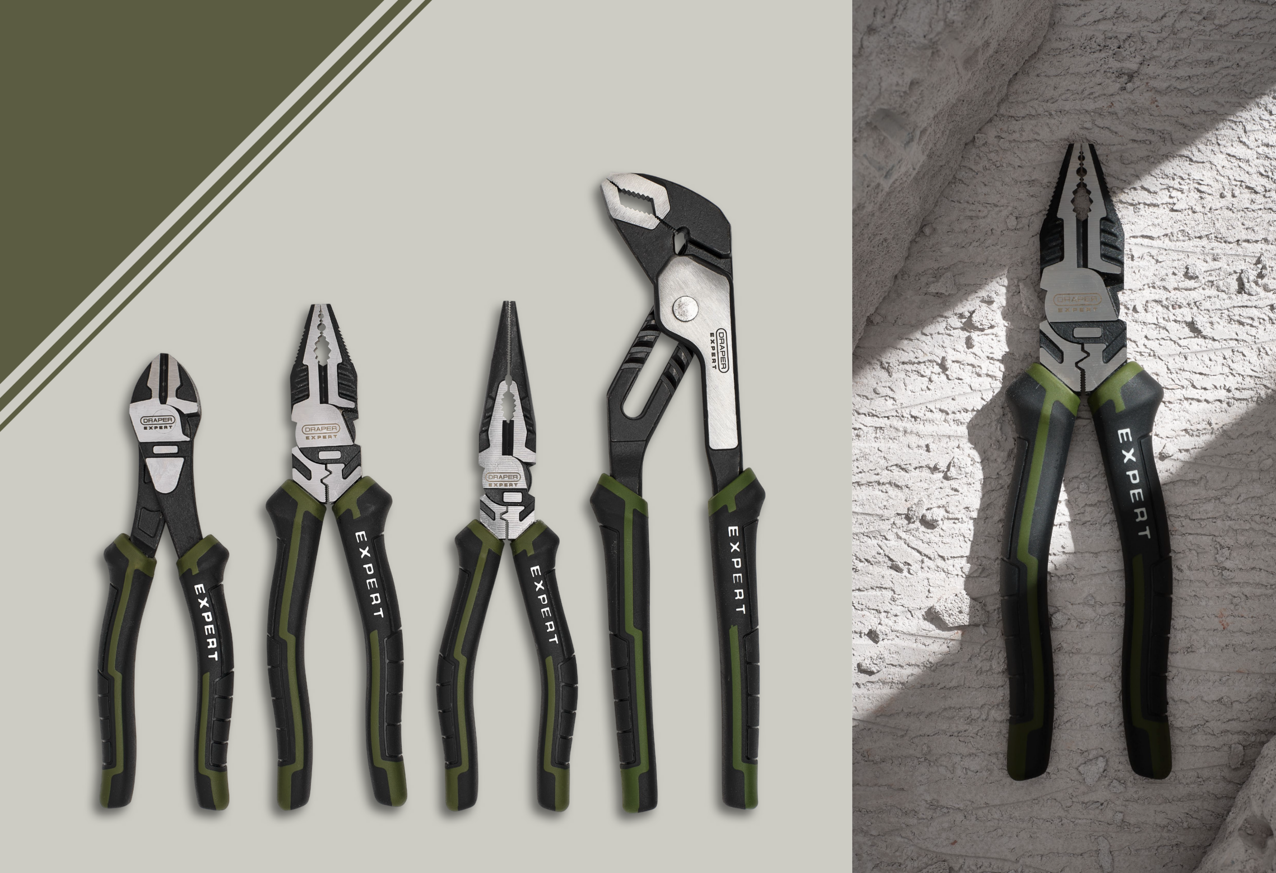
At the same time, Draper Expert was elevated from a sub-label to a distinct identity. A premium green-and-black colour palette was introduced, along with subtle carbon fibre-style textures, and a modernised layout system that visually separated it from Draper while clearly belonging to the same family.
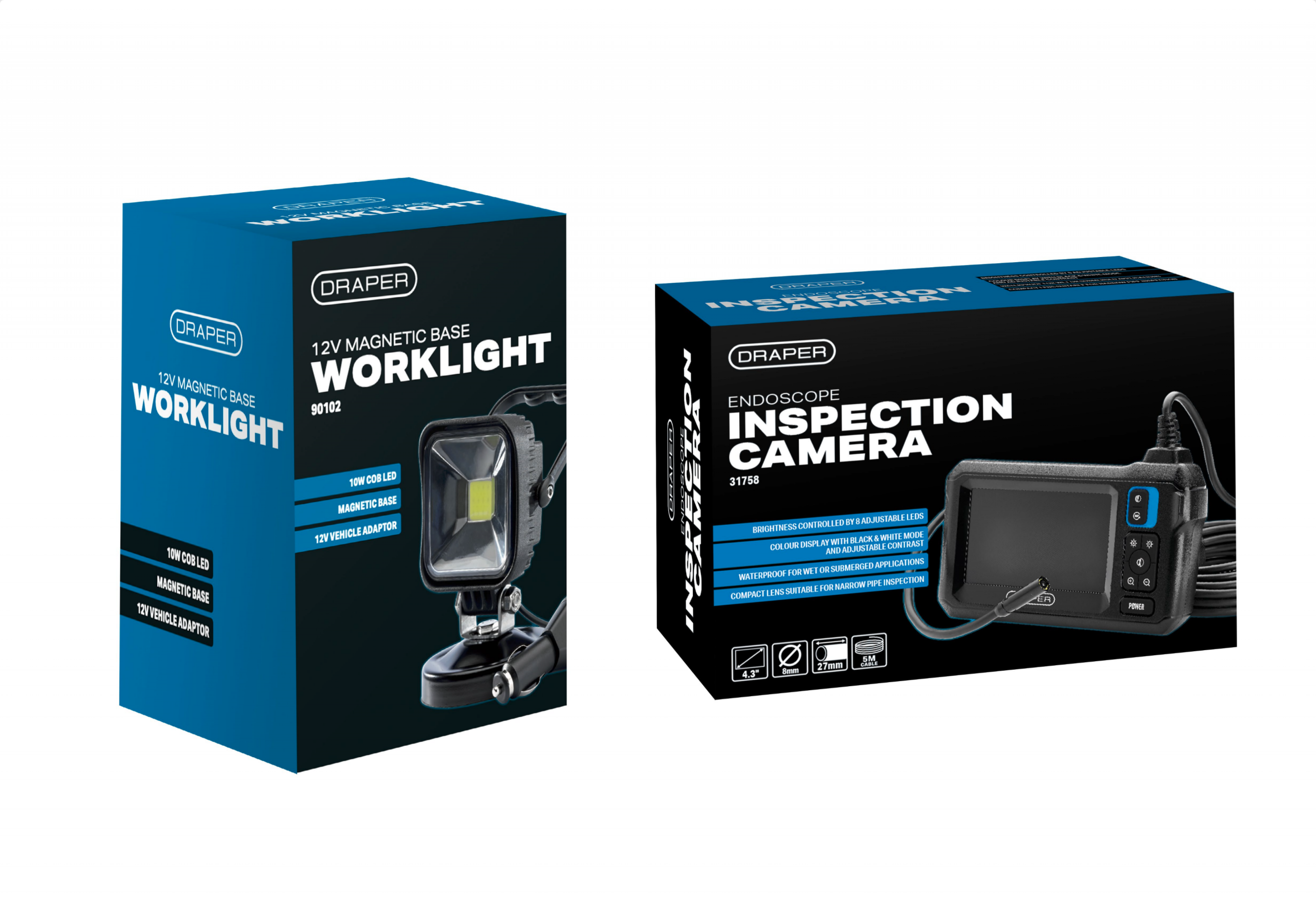
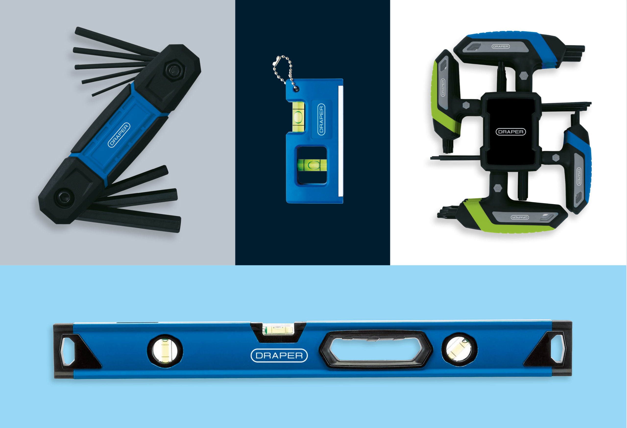
Beyond identity, I art-directed the rollout across every brand touchpoint – from packaging, tool markings, manuals, and signage to digital assets, email templates, exhibition stands, and sponsorship graphics (including Southampton FC and the Excelr8 British Touring Car team).
Internally, I led brand engagement across departments – creating guidelines, aligning teams, and helping buyers, marketers, and sales staff understand how the brand positioning should guide their decisions.

THE IMPACT
The rebrand was received exceptionally well – both internally and publicly. The Draper family themselves described it as a “fresh new chapter”, reflecting pride in how the brand now projects confidence and modern relevance.
Trade partners, customers, and internal teams praised the refinement and clarity of the new identity. Packaging efficiency improved, creative turnaround times shortened, and the visual consistency helped reposition Draper as a brand equipped for the next generation of professionals.
The project also helped to evolve the creative culture inside the business. I established a new 3D visualisation team and expanded creative production to Draper’s Shanghai office to accelerate packaging workflows and reduce costs. What began as a visual refresh became a wider transformation of how Draper managed creativity, communication, and brand experience.


SUMMARY
Rebranding Draper Tools wasn’t just about updating a logo. It was about redefining what the brand stands for – its story, its clarity, and its connection to customers.
It was an opportunity to bridge heritage and innovation – preserving a name trusted for generations while equipping it to inspire the next.


“Lennie has been a breath of fresh air to work with. He worked hard to understand our products, services and our business and what’s more, he is highly creative too! I would definitely recommend.”
“The work we did with Lennie was amazing and allowed us to hone down brand concepts and ideas. Being a creative company ourselves, also meant we faced a lot of challenges internally and these were very well smoothed out by Lennie.”
“Lennie has been an absolute joy to deal with and have produced work of the highest quality. The process of working in partnership with us, and ultimately the exceptional design work, has been highly impressive. We hope to remain clients of all yours for many years.”
“Lennie comes with many years experience within the creative industry and is able to transfer his excellent creative and project management skills onto team members allowing them to grow and flourish. With his studio management experience, he is able to drive business process improvements and change. I would highly recommend his creative services..”
Lennie didn’t hesitate to offer to help our charity Sustain For Life. He created some fantastic designs for our 2018 Christmas campaign which helped us generate essential charity donations. The turnaround of the work was quick and high quality making the whole process stress free! Having worked with Lennie previously for many years I know his work is consistently good and always happy to help. I wouldn’t hesitate to recommend.