Outcome: A clear, values-led brand used across all touchpoints
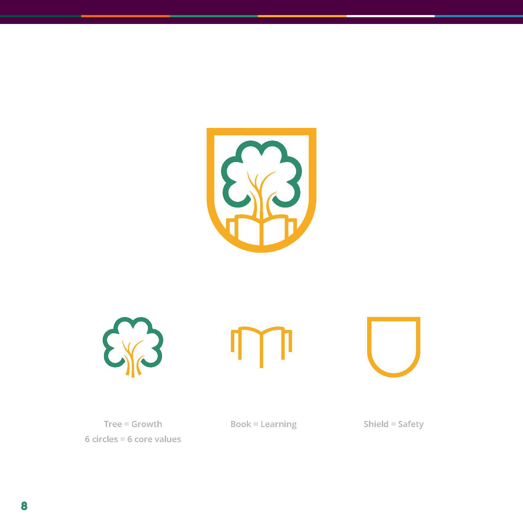
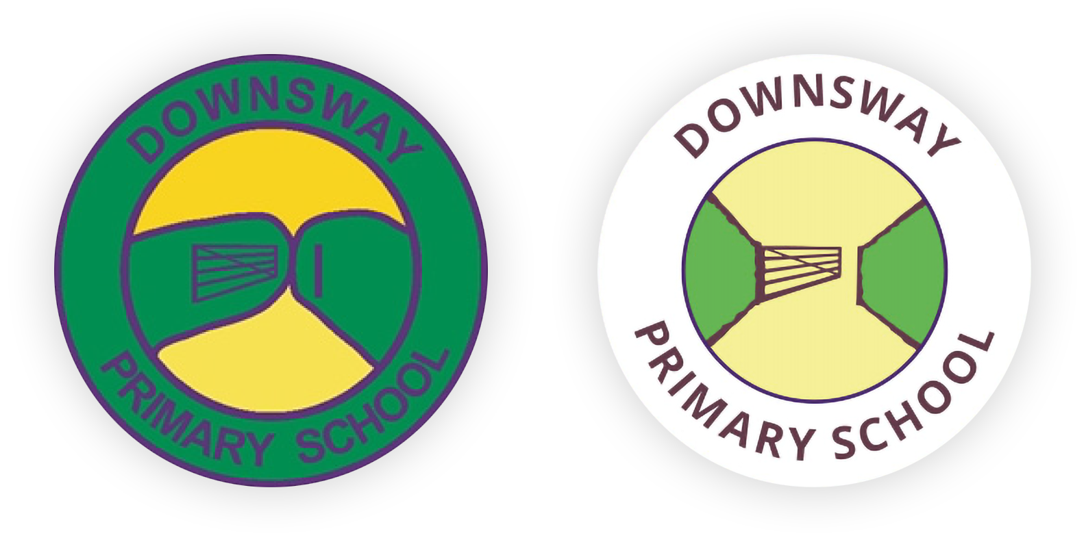
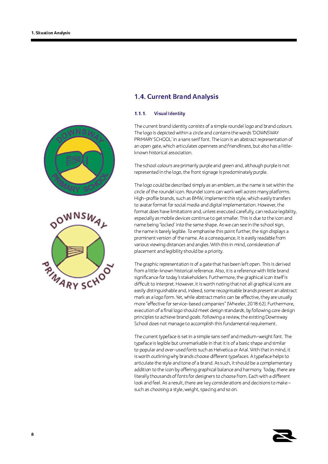
The original logo lacked clarity and legibility, with a gate symbol that was difficult to interpret in application.
Situation
Downsway had a clear vision and strong values, but the brand felt dated and inconsistent. With several local schools saying similar things, it was hard to stand out.
Task
I was asked to redefine the brand, creating a clearer position, stronger identity and a system that could be used consistently across all touchpoints.

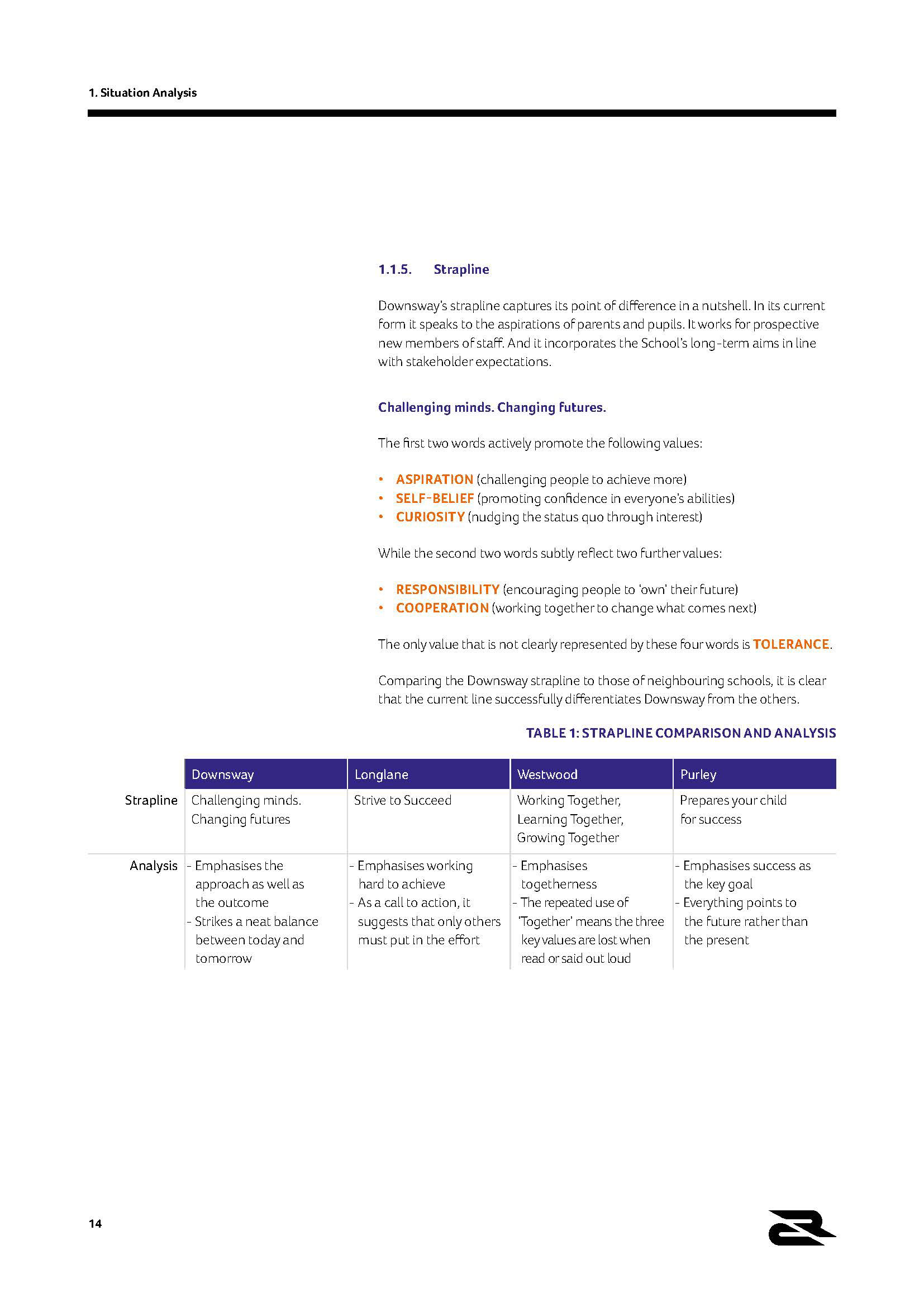
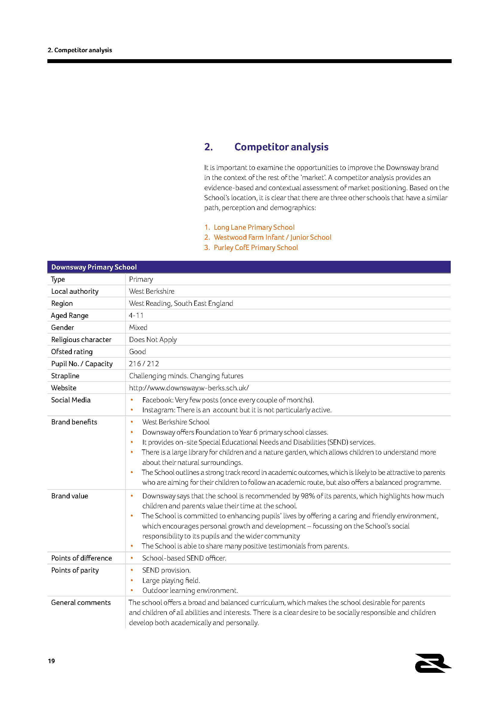
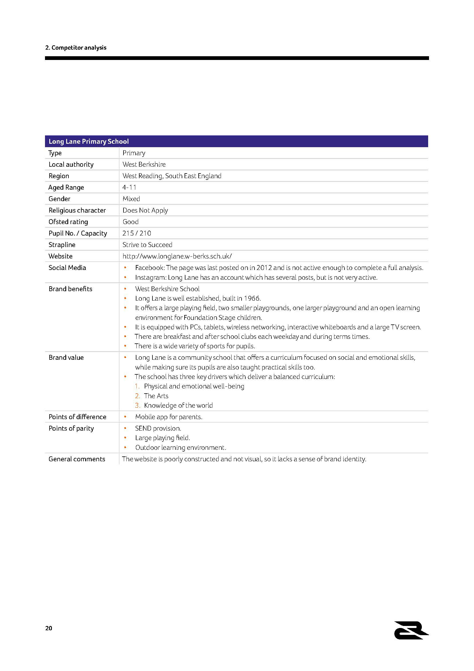
Action
Carried out a full brand review, covering identity, messaging and competitor activity.
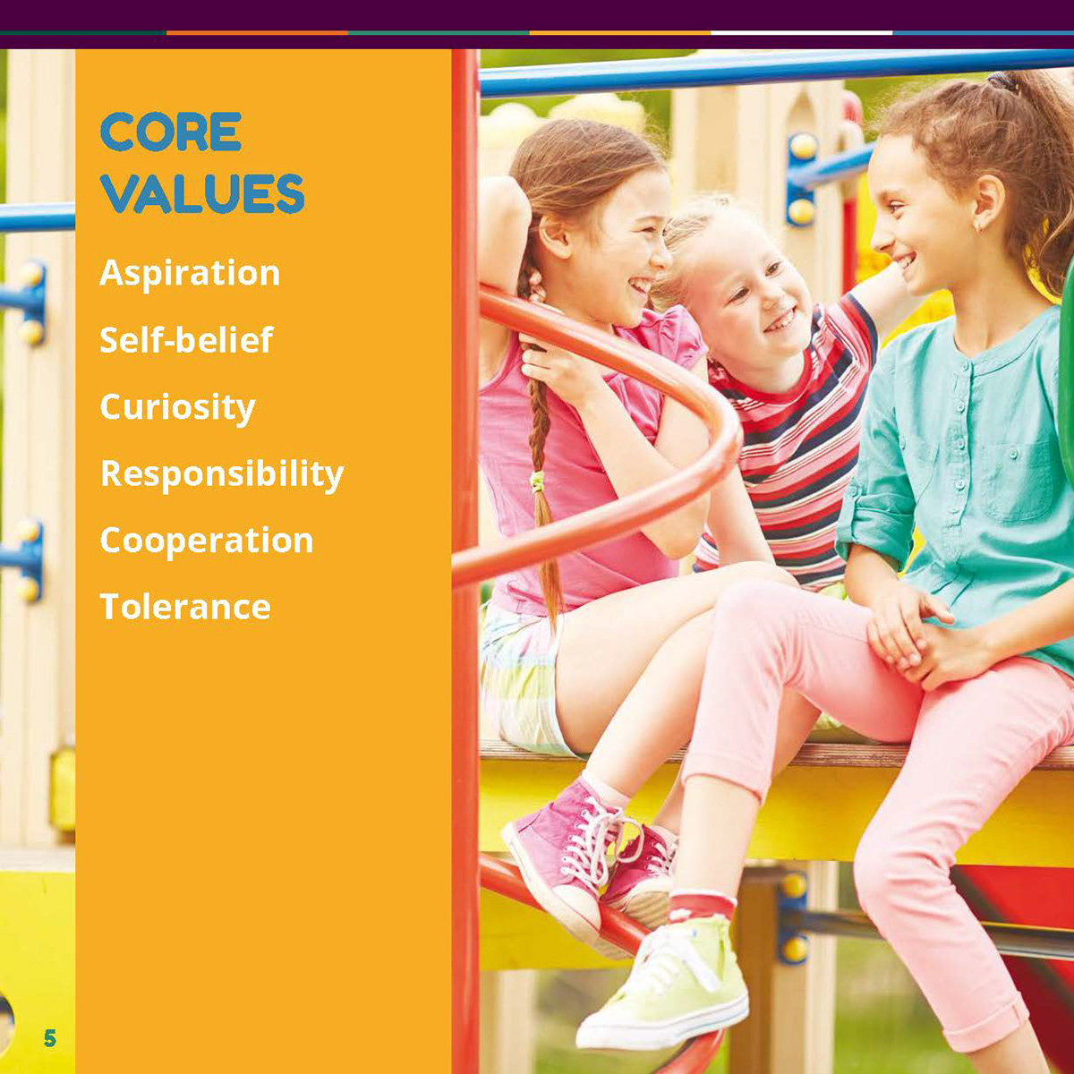
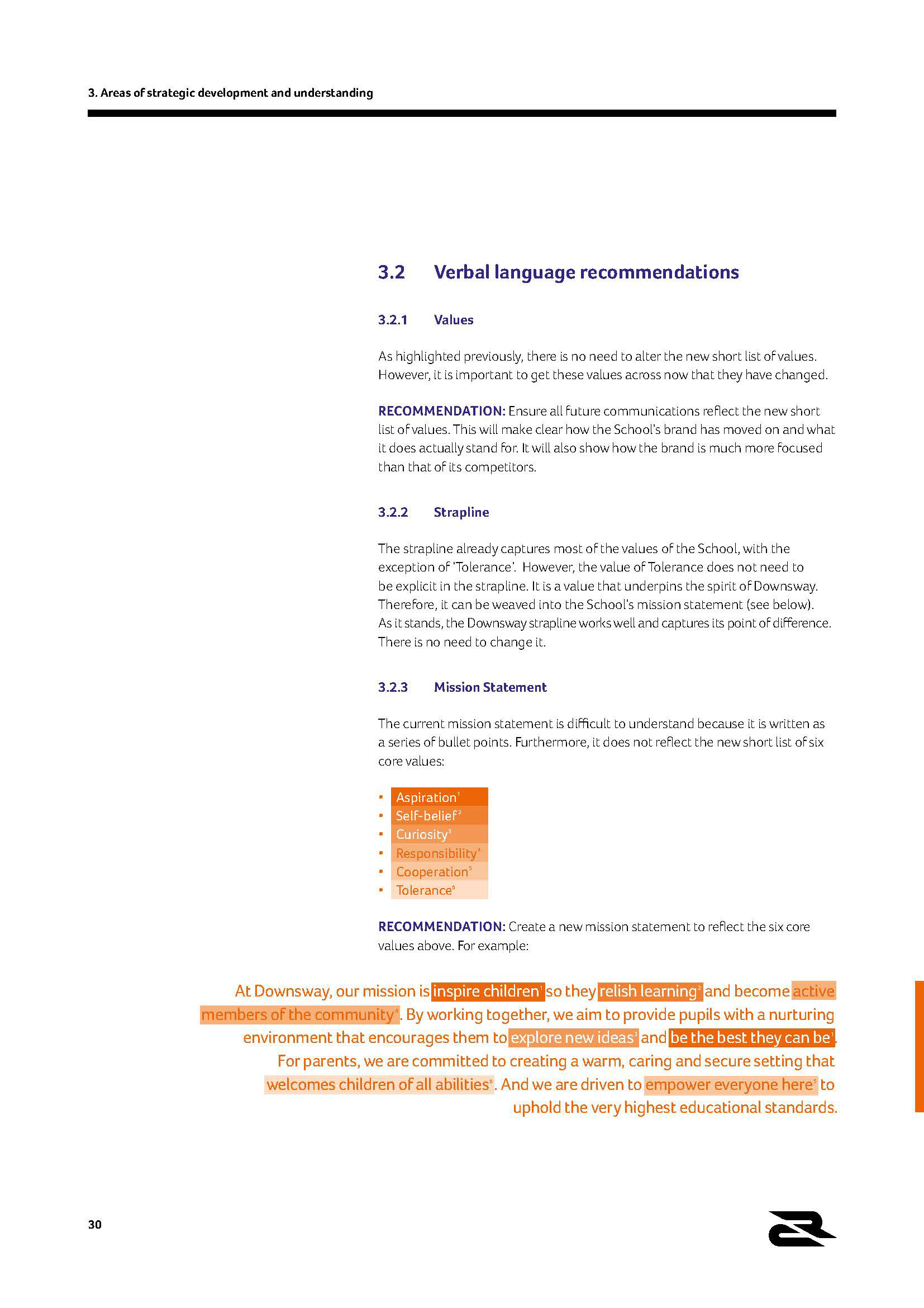
Simplified the school’s values into a clear, usable set to guide the brand.
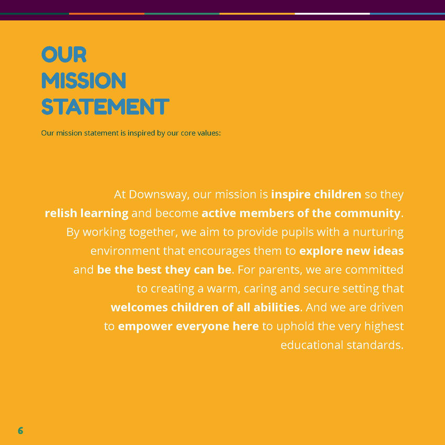
Set the positioning and tone of voice to keep communication clear, warm and consistent.
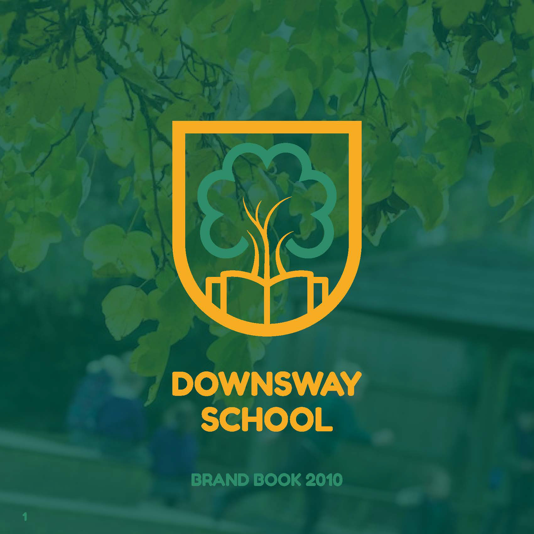
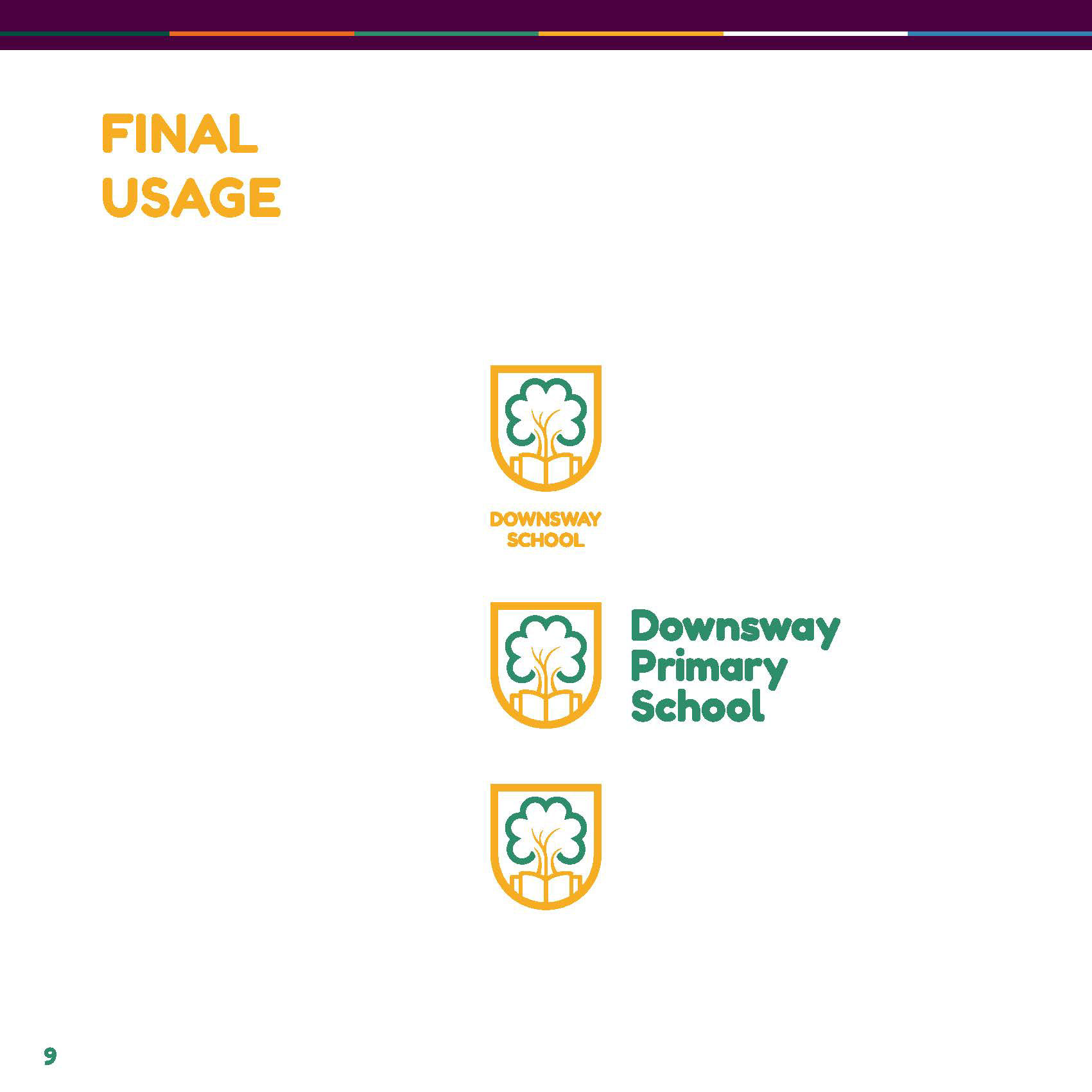
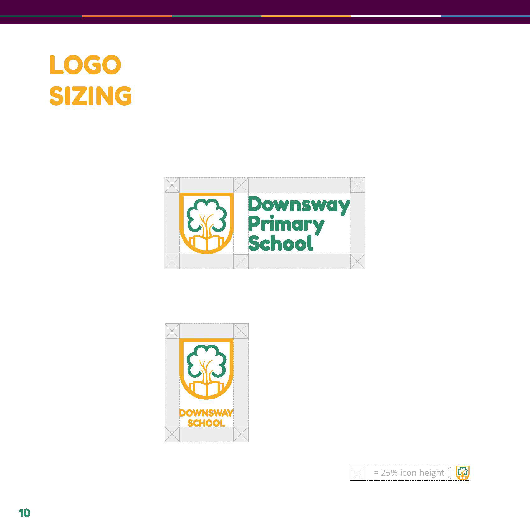
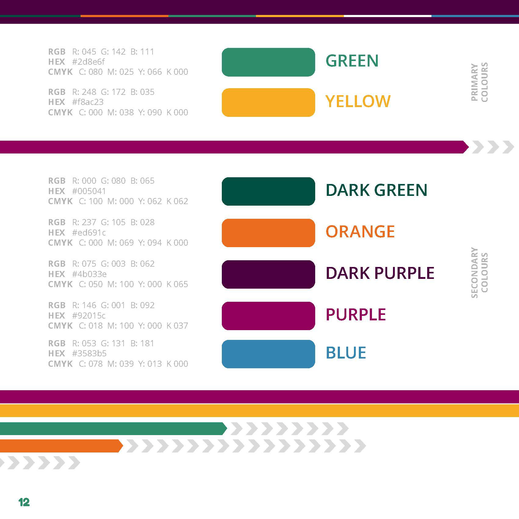
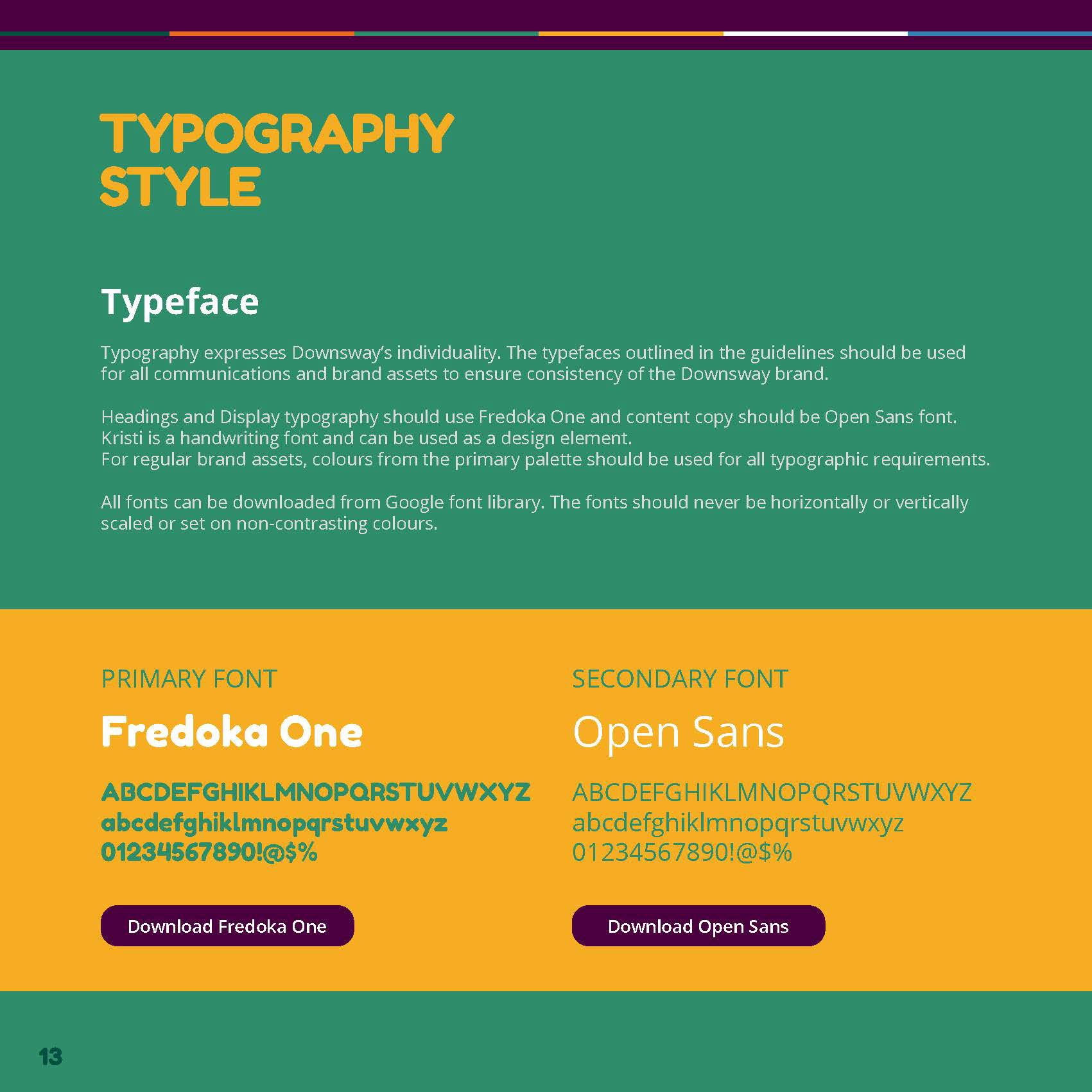
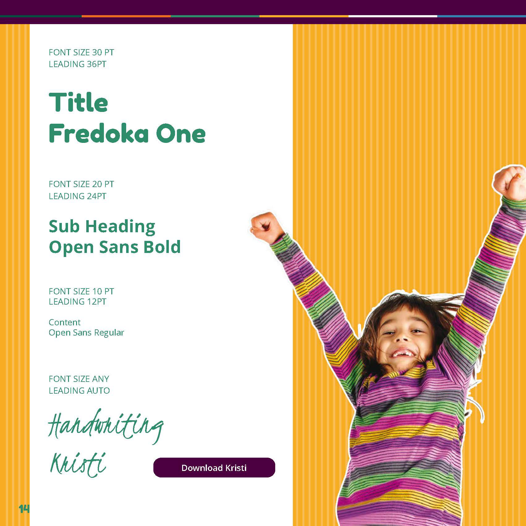
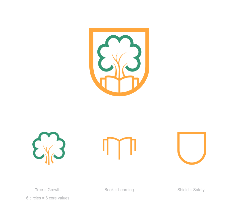
Redesigned the identity, including logo, colour and typography, focusing on clarity and legibility.
Produced a full set of brand guidelines to support consistent use across all touchpoints.
Result
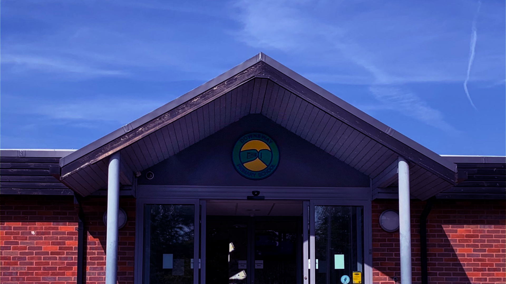
The school now has a clear, consistent identity.
It’s easier to use, more recognisable, and provides a solid base for future communication.